
Hello Logo Rebrands!
As a creative business, we’re always looking at how to best visualise the business and express our core brand values. Moving forwards the idea was to create something fun, friendly and approachable, as a lot of people can feel a bit wary when first approaching a graphic designer. One of our USPs is client communication and making them feel a big part of the design process, with an emphasis on communication between designer and client. So for us this feels like a step in the right direction for putting that across.
We’re still the same amazing designers, but finally with a logo/brand we’re truly passionate about and feel really shows what we stand for and our core values!
Looking deeper into the actual logomark, we’ll point out a few key features you may have missed.
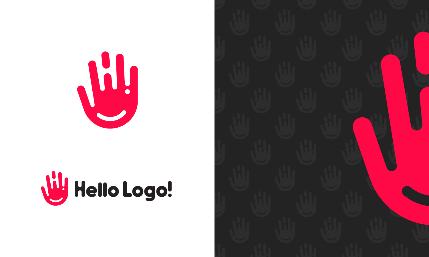
We knew moving forward with any potential new logo design that we still needed to include our trademark ‘H!’, which is made up of the first and last parts of the name ‘Hello Logo!’ – Coming together to “say H!”, or Hi as it would be. With this in mind we had to play around with different ideas and images, all the while trying to incorporate the H! without it looking forced. Fortunately it was quite early in the design process we started looking at the idea of a waving hand and it all kind of just came together naturally once we started sketching out ideas… Finding it’s almost natural place between the index finger and the pinky.
So with our key element now implemented, we focused on making it look as fun and friendly as we could. This led to adding a crease at the bottom of the hand that curved round to the base of the exclamation mark, thus creating a subtle smiley face. With this being the secondary feature though, we had to be careful not to have too much focus on the face and keep a natural distance between the smile and the eye.
And there you have it. A waving hand with a smiley face that says H!
After that, the wordmark was just a case of selecting the right font and customising it to match the hidden H! within the logomark. This is the first time we’ve strayed away from the classic straight-edged, sans serif font and it just feels right having something more rounded and friendly looking. Hopefully giving the logo as a whole, this welcoming vibe that makes you want to Come Say H!

No Comments